


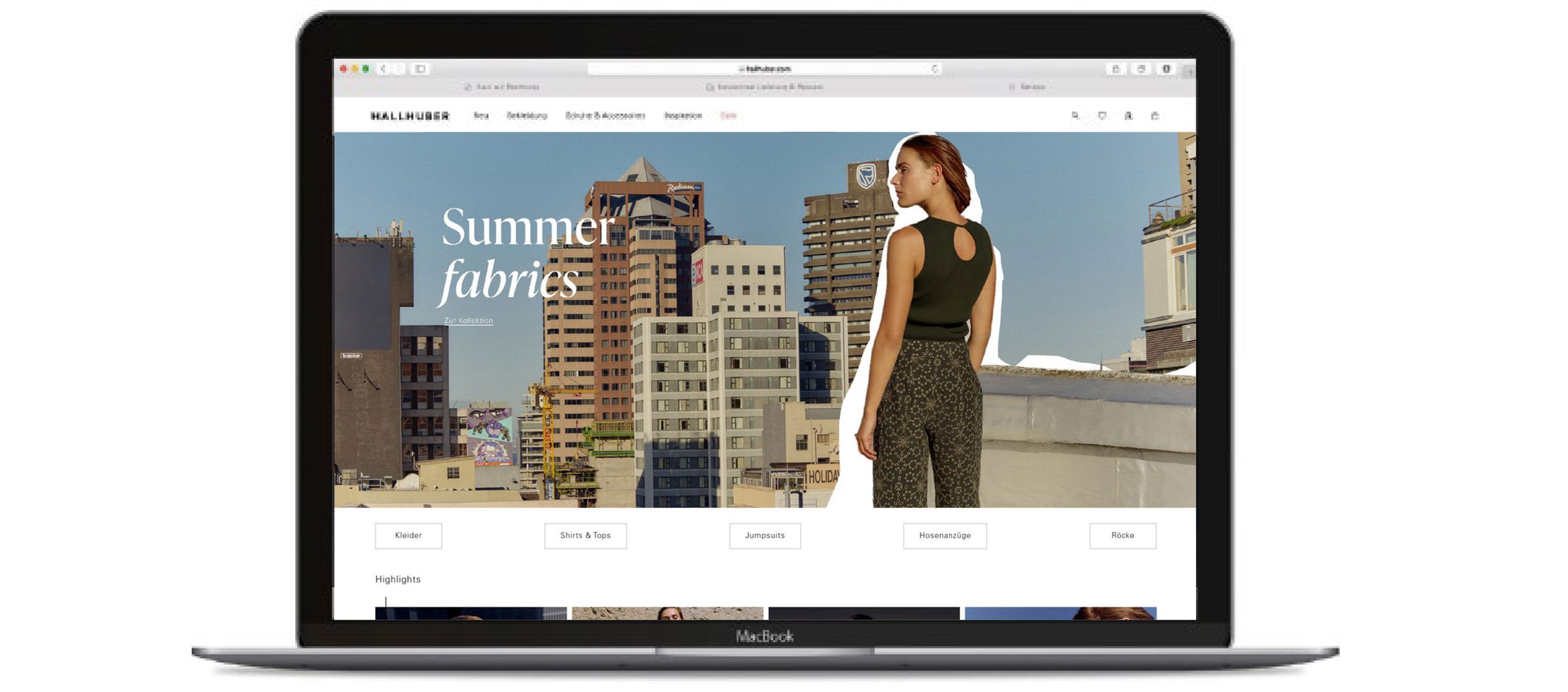


Visual concept Hallhuber typically got its collection concepts from YCCP. During a month without new collections, I designed a series of new concepts with campaign photos, that hadn’t been prominently used on the Website before. The design with the white cutout border was selected by the Head of Onlineshop and featured on the homepage.


Creation of performance banners Based on the YCCP template, application of the concept to other formats

Redesign of the Hallhuber Newsletter UI A cleaner look for the Newsletter was achieved by a more minimal approach.


Material information banner The online shop team was looking for a way to increase the time users spend on the product detail page while at the same time justifying the higher prices with material information. I developed the concept for a clickable banner that can be opened as an overlay.

Redesign of the Onlineshop Product Listing Page A cleaner look for the Page was achieved by a more minimal approach. Unfortunately, I have not been able to do any shortening of the product descriptions.
Similar items button Another measure to increase the time users spend on the product detail page was the inclusion of a 'similar items' button. I prepared two different UX/UI solutions.


Creation of the voucher cards

Image retouching The cropped mannequin image of an organza blouse didn't convey the transparency of the garment, I edited the image to adjust the impression.